
Overview
This two-phase UX research project explored how the Alberta Animal Rescue Crew Society (AARCS) website guided users toward key support actions such as donating, fostering, and volunteering. Through card sorting and tree testing, I investigated how navigation structures, labelling, and information grouping influenced users’ confidence, decision-making, and willingness to engage with the organization.
Findings revealed that even small moments of confusion within the website architecture could discourage engagement, while clearer language and more intuitive pathways significantly improved users’ ability to confidently take action.
When: September-November 2025
Where: Information Architecture Course
Skills Developed:
- Usability Testing
- Data Analysis
- Sitemap Design
- Content Modelling
- Technical writing
Tools Used:
- Optimal Workshop
- Excel
- Canva
- Google Docs
The Context
Why does this research matter?
People often want to support animal rescue organizations, but confusing website navigation can foster hesitation and quickly discourage people from taking action.
The Alberta Animal Rescue Crew Society (AARCS) relies heavily on public engagement through donations, volunteering, and fostering. This project explored how effectively the organization’s website guided users toward these support pathways and whether moments of confusion within the navigation structure impacted users’ confidence and decision-making.
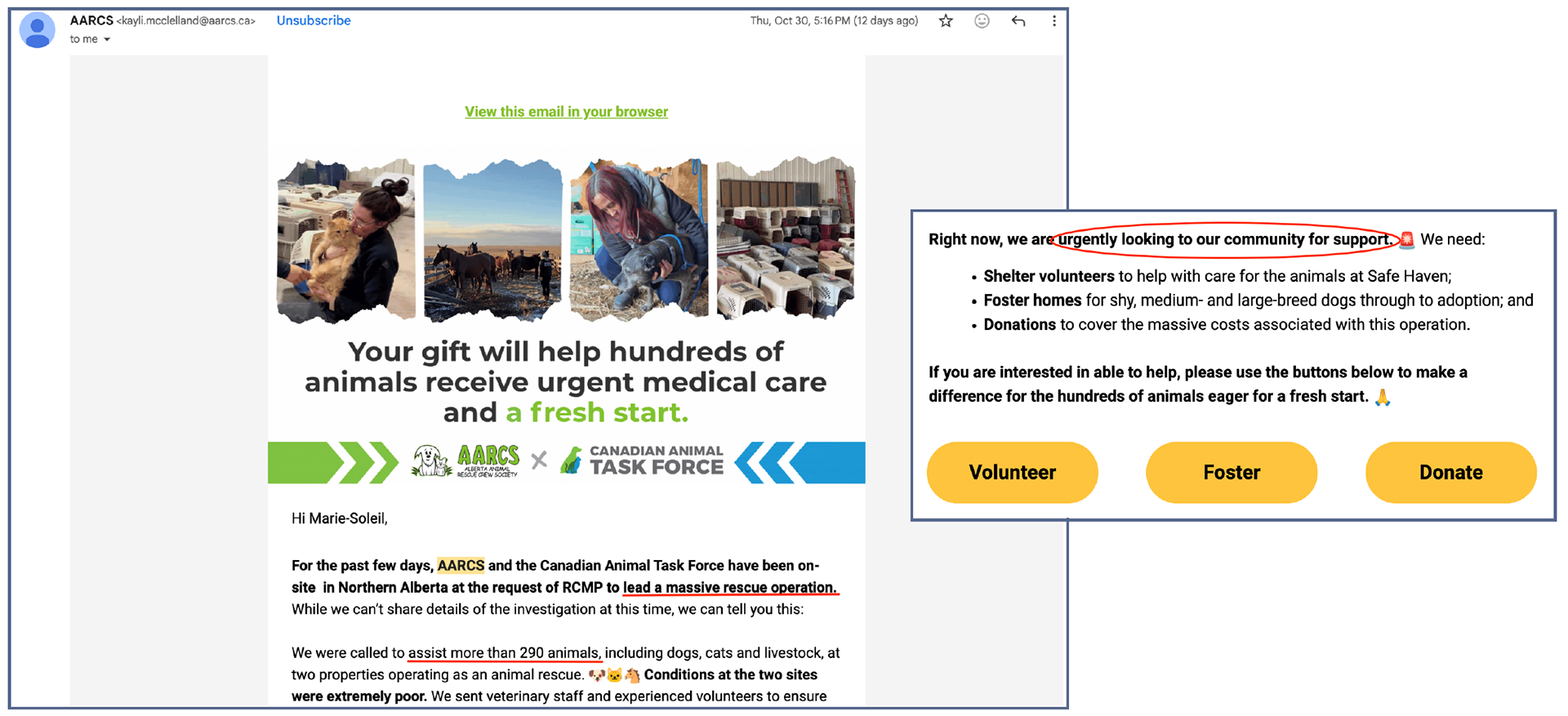
Email sent on October 30th mentioning the recent animal rescue operation in Valleyview with clear calls-to-action to attract more support from members, donors, and volunteers. (Hudon, 2025)
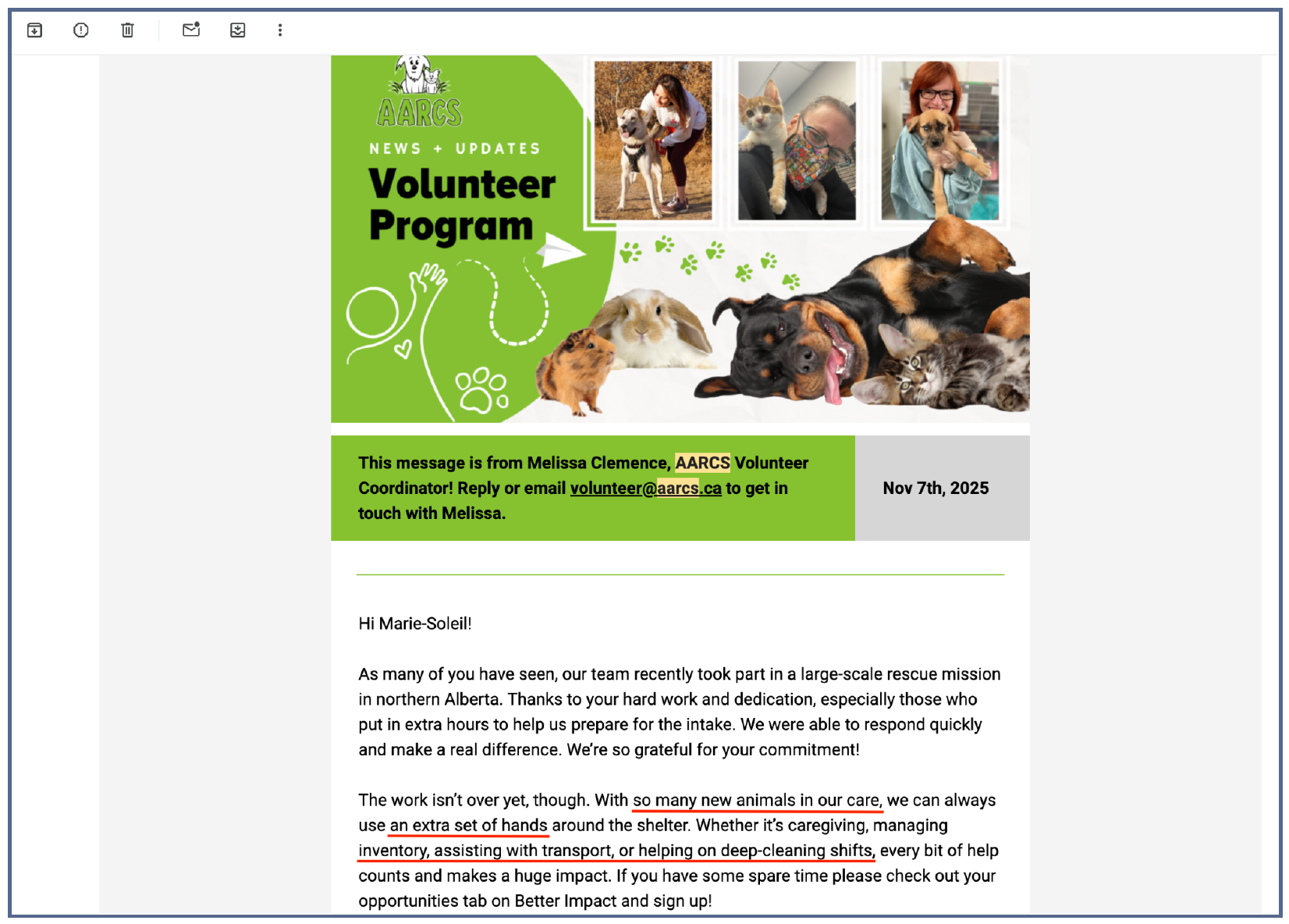
Email sent on November 7th to current volunteers regarding the high intake of animals and urgent need for volunteers’ support, following the RCMP-led animal rescue operation. (Hudon, 2025)
The Research
Phase 1 - Card Sorting
How Do Users Expect Information to Be Organized?
I first wanted to understand how users naturally grouped and interpreted information about volunteering, donations, fostering, and other support across the AARCS website.
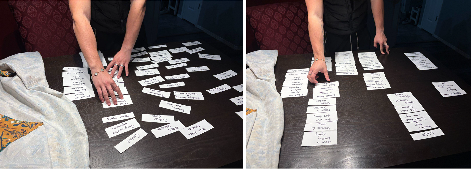
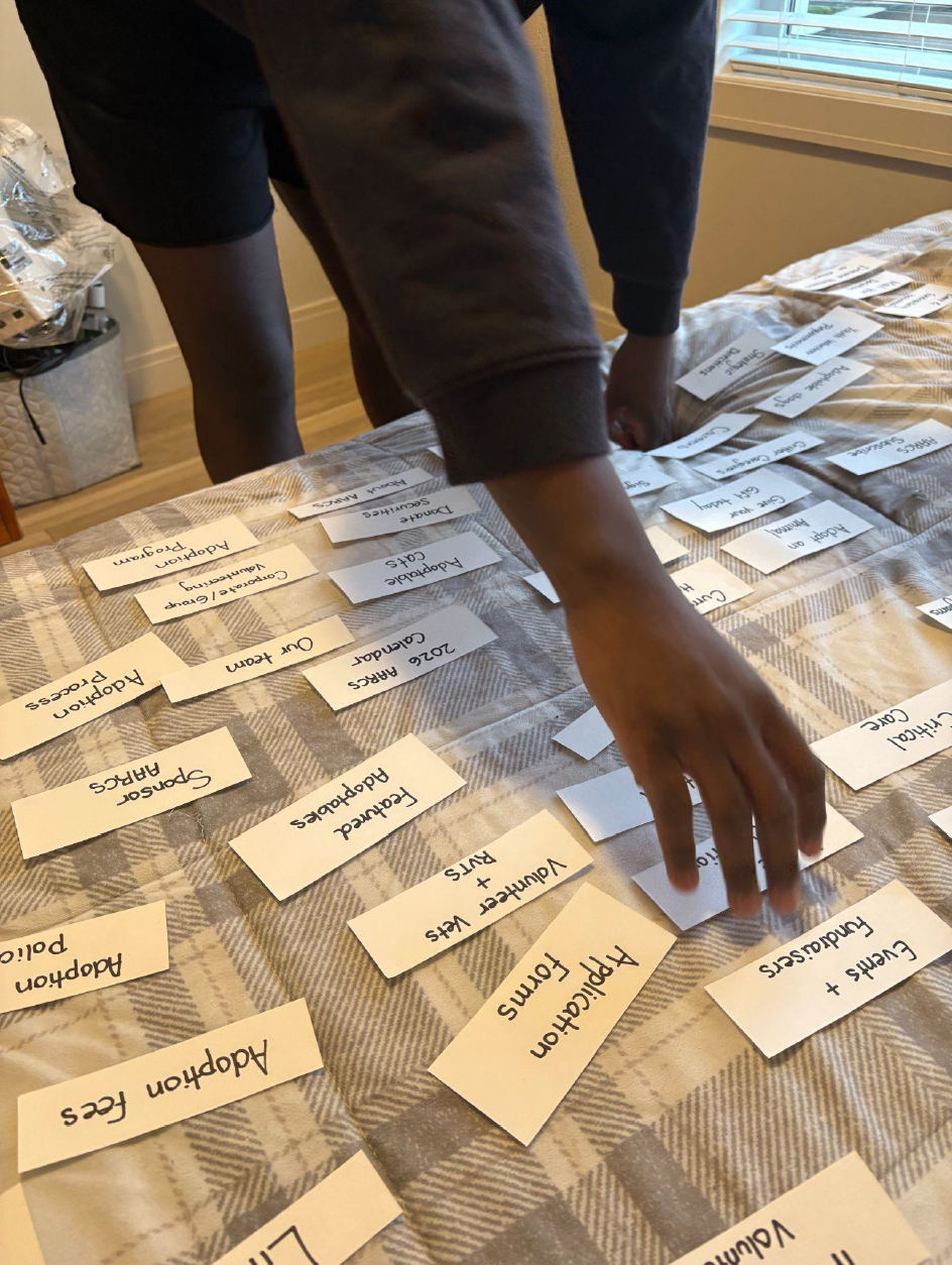
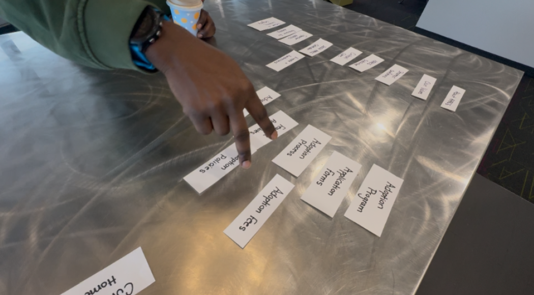
To do so, I conducted seven moderated, in-person card-sorting sessions in which participants organized website terms pulled directly from the AARCS website.
Main Actions
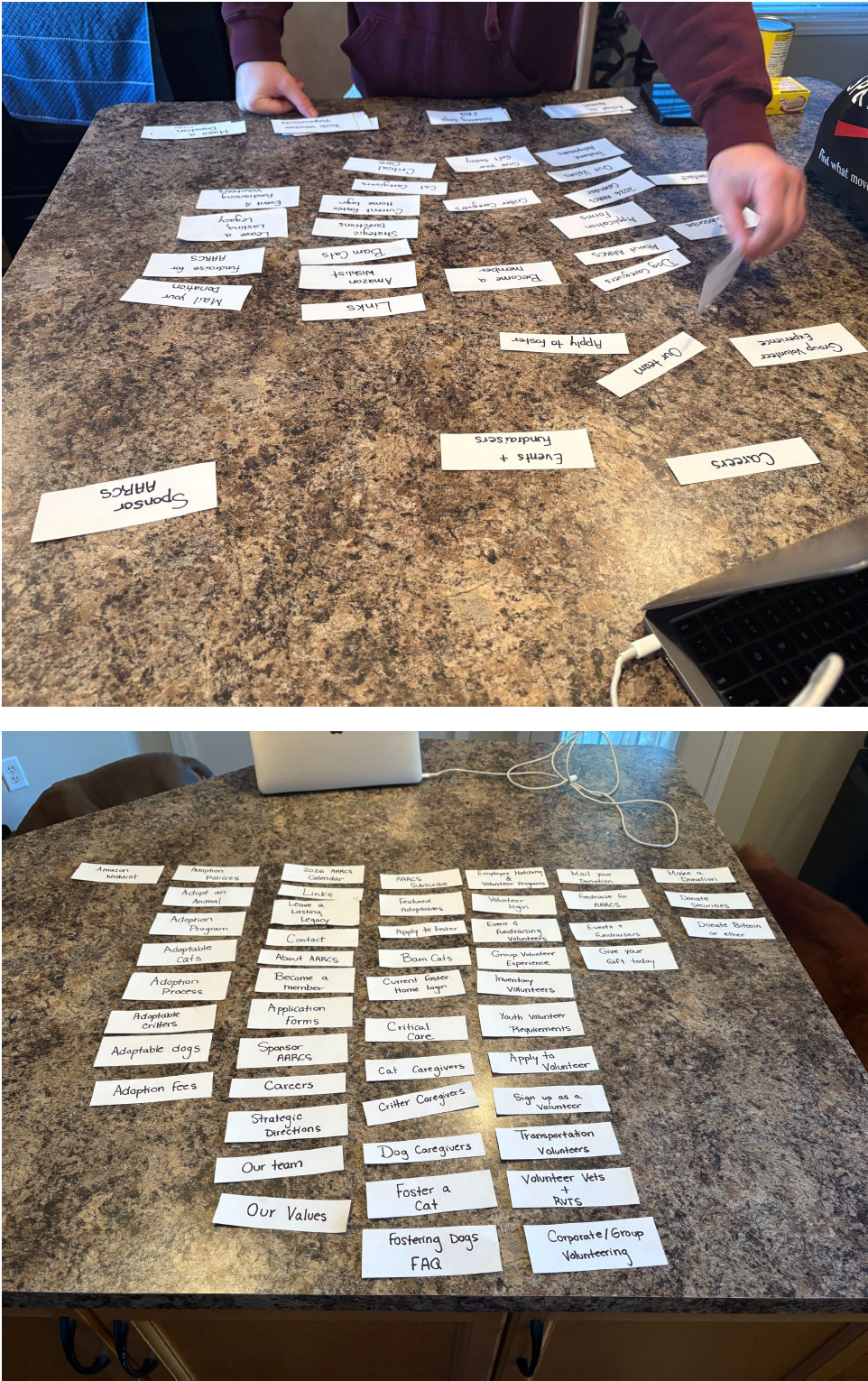
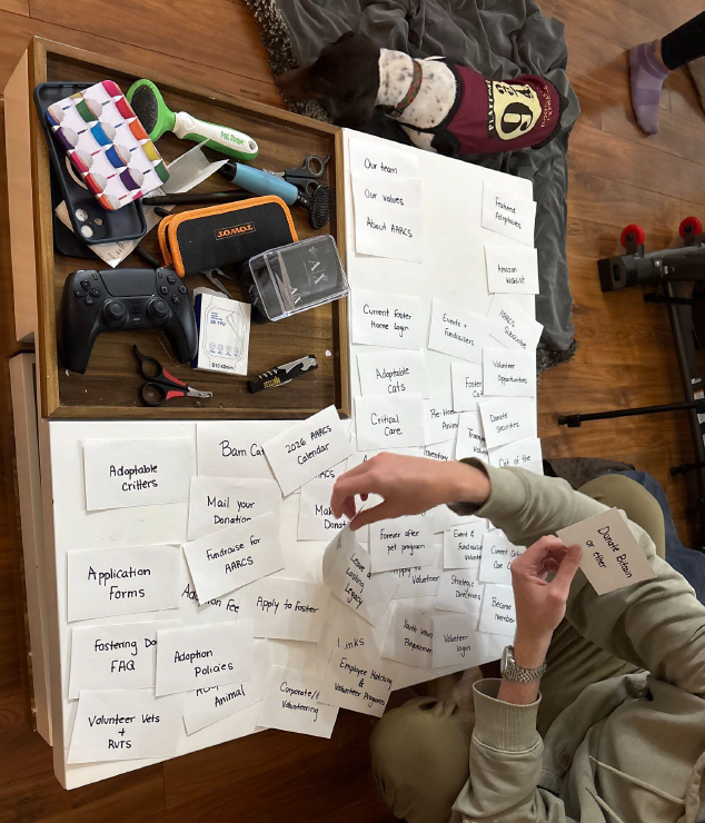
1. Created a 50-card set using terms pulled from the AARCS website
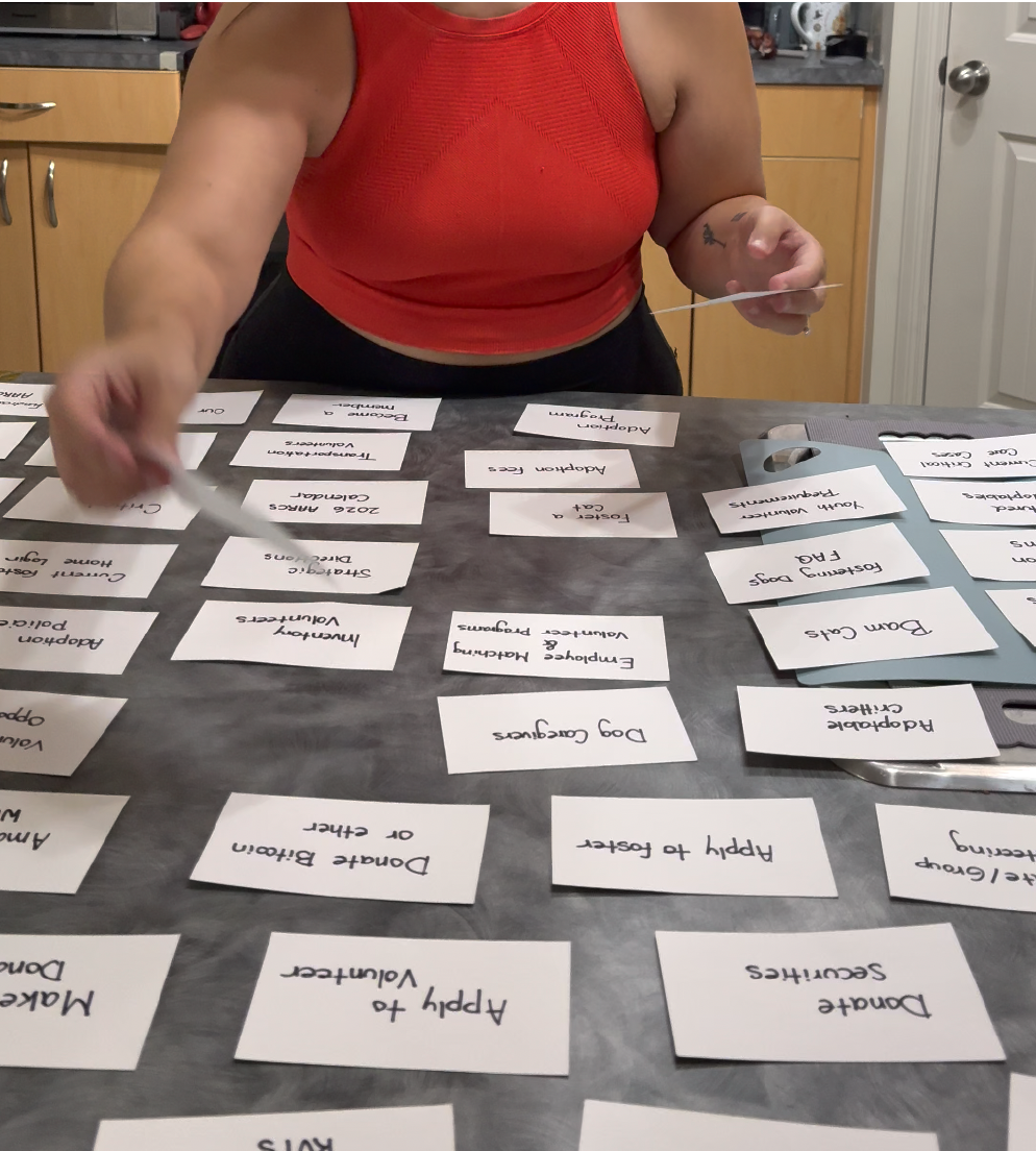
2. Conducted moderated in-person card sorting sessions with 7 participants
3. Observed how users grouped, labelled, and interpreted support-related content
4. Identified moments of hesitation, confusion, and overlapping terminology
Key Findings
- Participants struggled with vague or repetitive wording, like "volunteer," "volunteering," and "get involved."
- Several users expressed uncertainty around labels such as “caregivers,” “critical care,” and “leave a legacy,” particularly when little context was provided.
- Participants unfamiliar with AARCS often felt less confident navigating the information architecture and described the experience as overwhelming.
“I wouldn’t want to volunteer, because they’re making it so hard for me to volunteer” - Jonah
These findings suggested that unclear terminology and overlapping categories may unintentionally discourage users from engaging with the organization, even when they already had intentions to help.
Participant 7 Card Sorting Process
Participant 5 Card Sorting Process
Participant 4 Sorting Cards
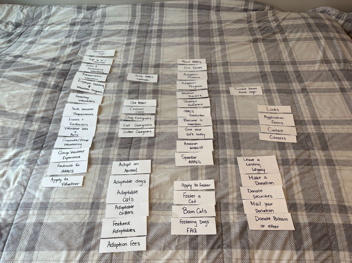
Participant 4 Final Outcome
Participant 3 Sorting Cards
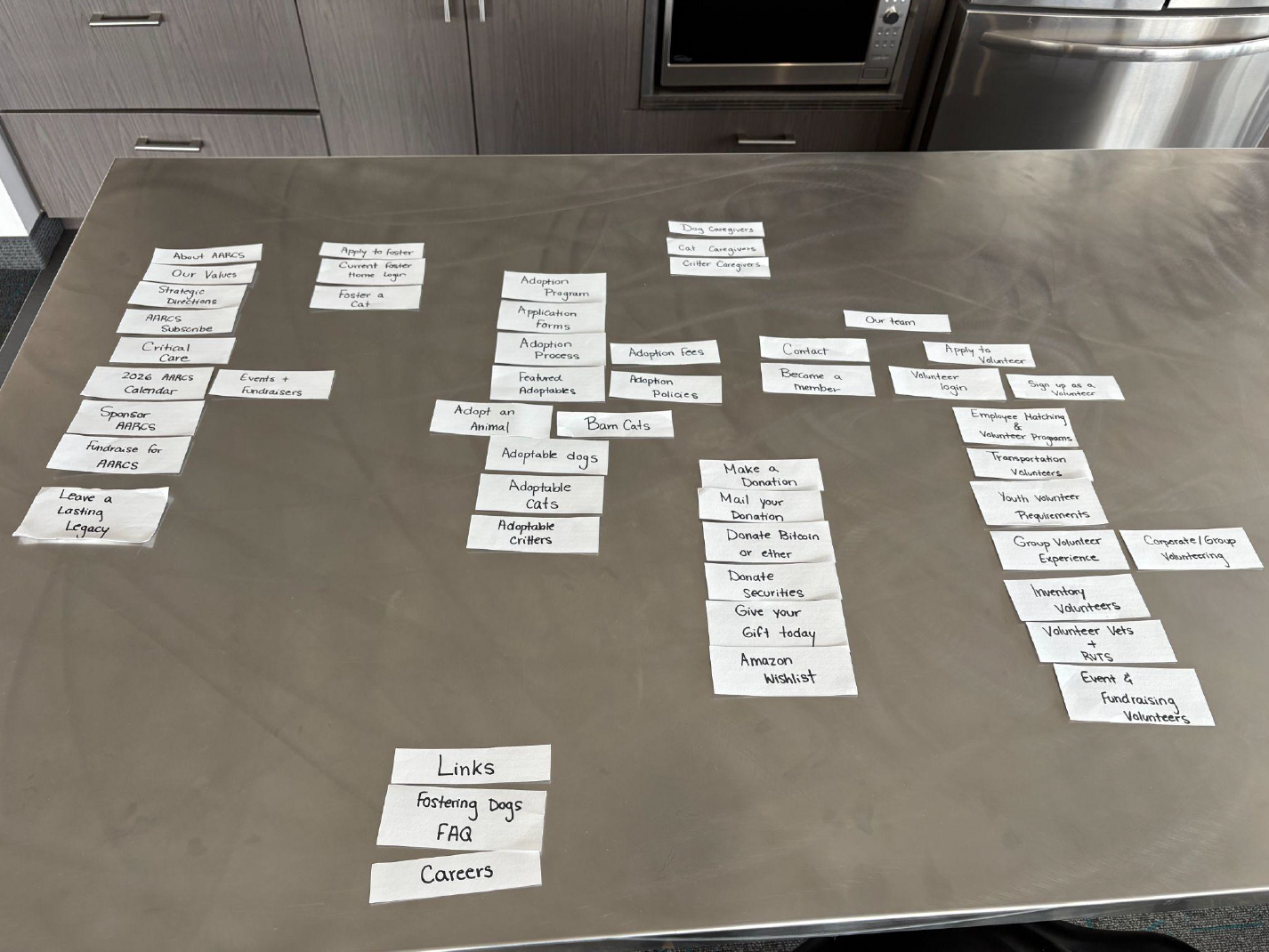
Participant 3 Final Outcome
Participant 2 Sorting Cards
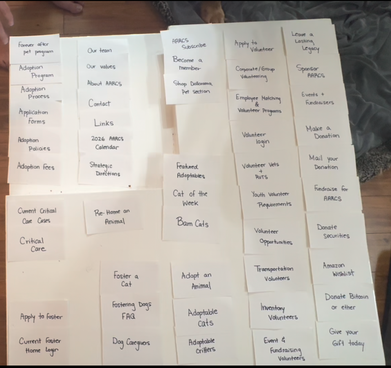
Participant 2 Final Outcome
Participant 1 Sorting Cards
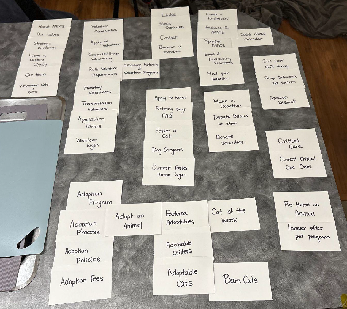
Participant 1 Final Outcome
Phase 2 - Tree Testing
How Can AARCS Navigation Be Improved?
After noticing that many users struggled with AARCS’s labels and categories during the card sorting phase, I wanted to better understand how these moments of confusion affected people’s ability to navigate the website and support the organization.
To explore this, I conducted remote tree testing focused on common actions such as donating, fostering, and volunteering. The goal was to see where users felt confident, where they became unsure, and how the website’s navigation either helped or discouraged them from taking action.
Main Actions
1. Create an initial sitemap outlining the website’s current structure.
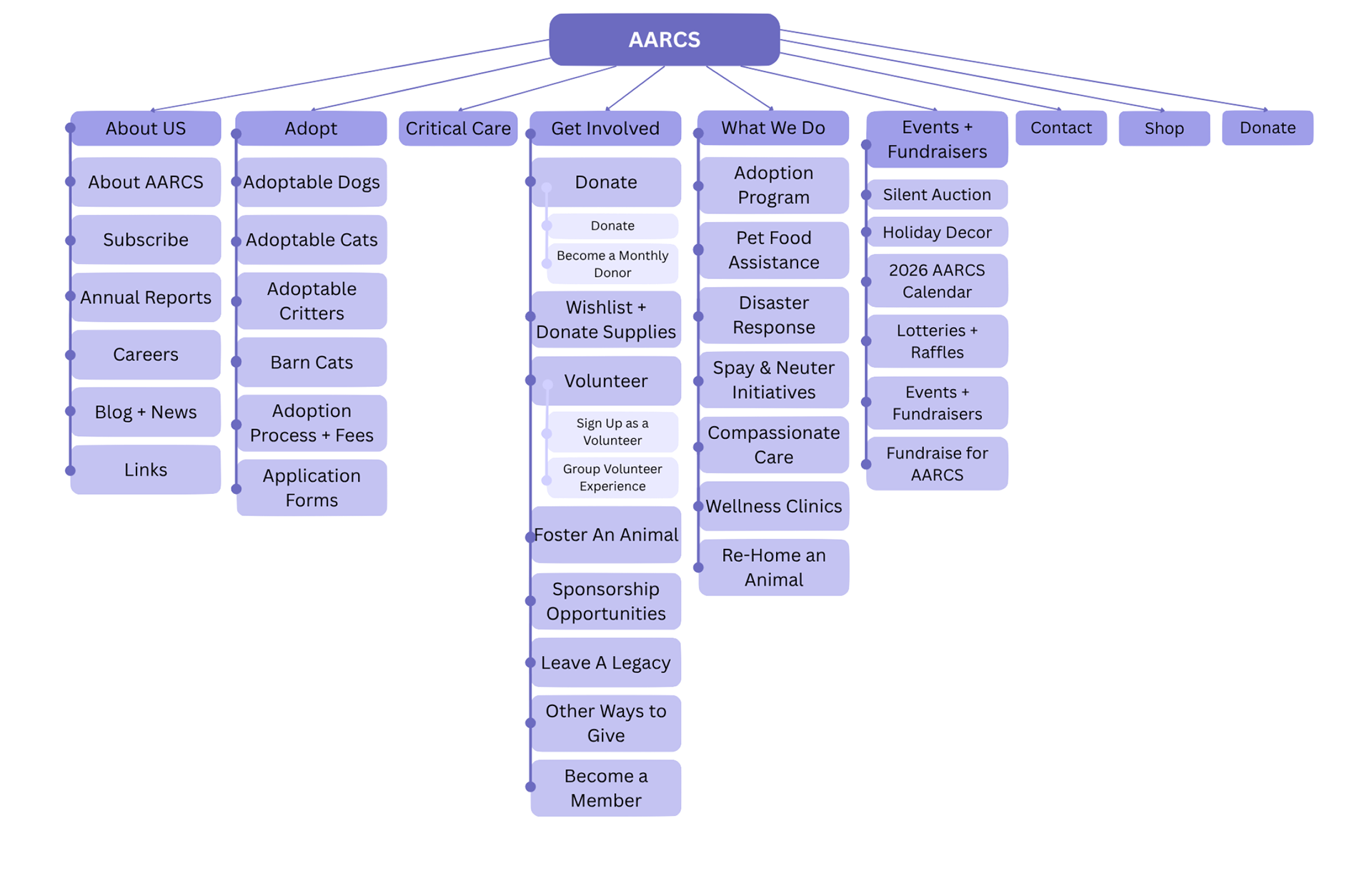
Site map of AARC's current navigation menu designed through Canva. (Hudon, 2025)
2. Conduct Tree Test 1 to assess how well the website's structure facilitates quick and accurate decision-making.
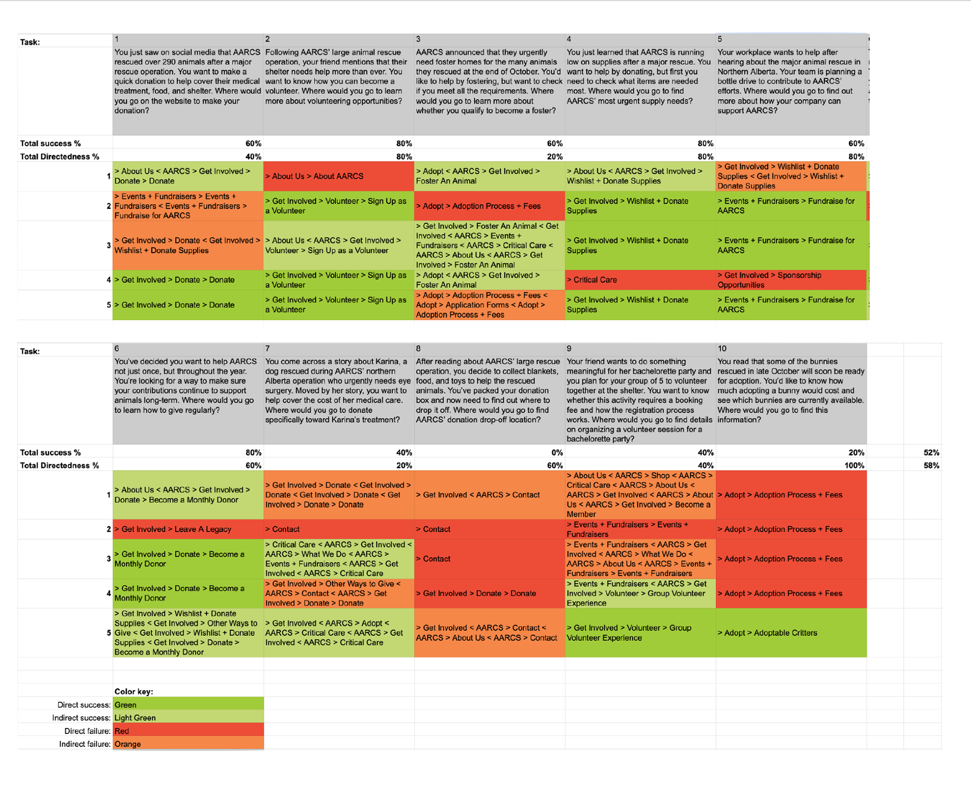
Analysis of user pathways combined with the overall task success rate and directedness. (Hudon, 2025)
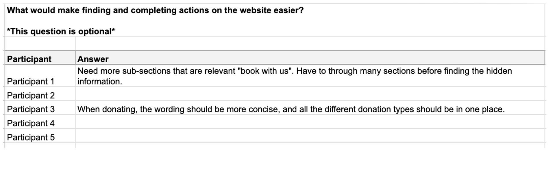
Additional feedback provided by the participants from the first tree test. (Hudon, 2025)
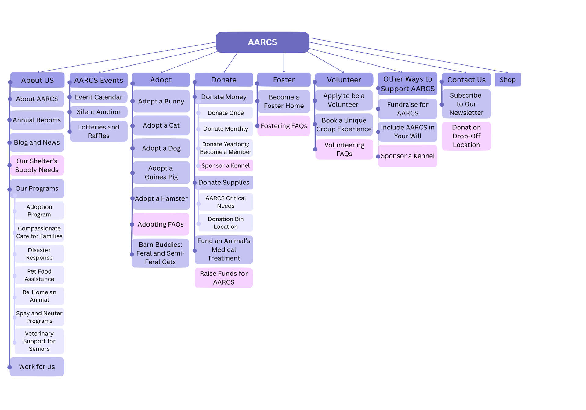
3. Analysis of initial findings and re-design of sitemap, addressing any issues encountered by users in the initial website structure.
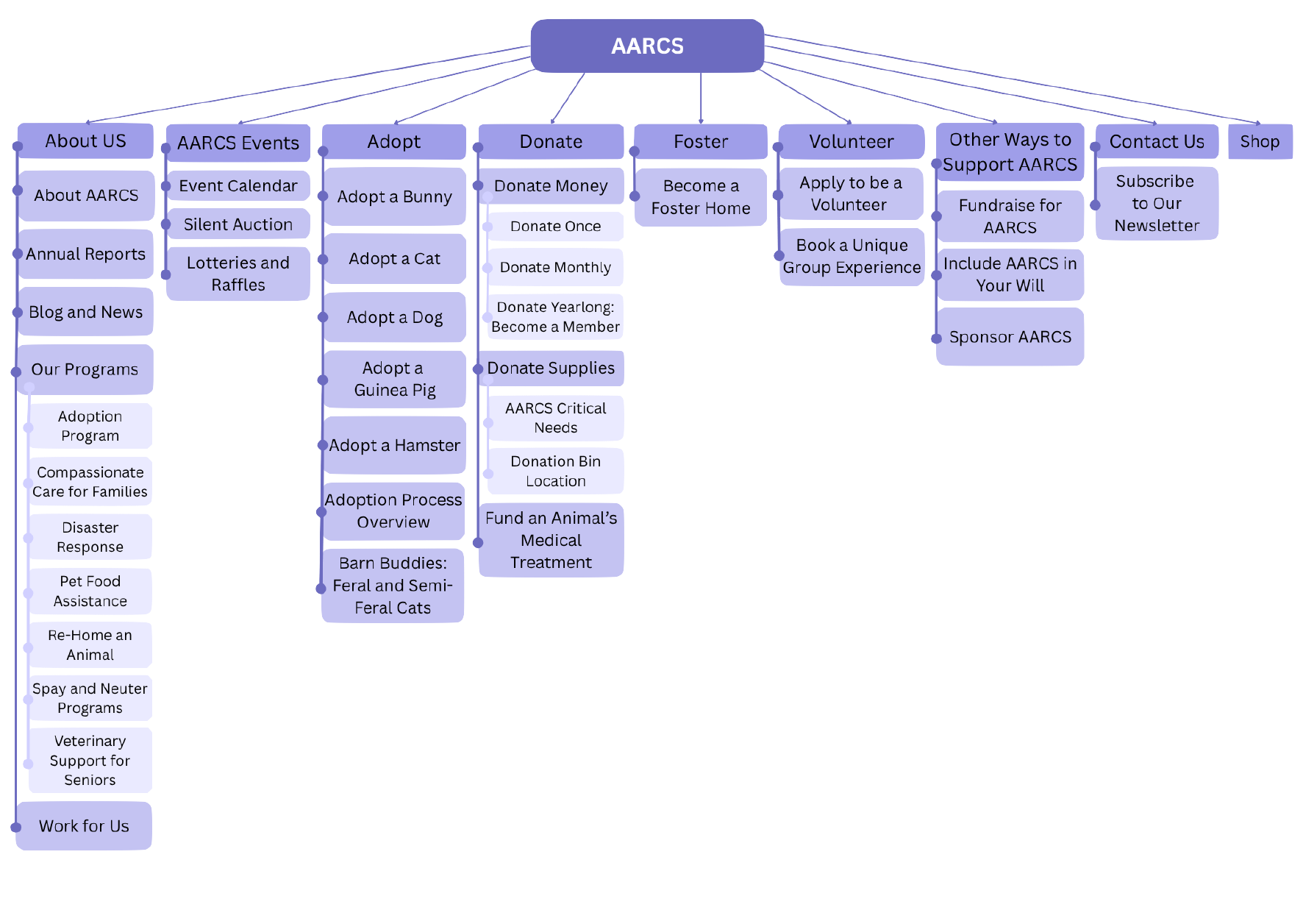
New, improved site map for AARCS designed through Canva. (Hudon, 2025)
4. Conduct Tree Test 2 to assess whether the proposed changes improved navigation and decision-making.
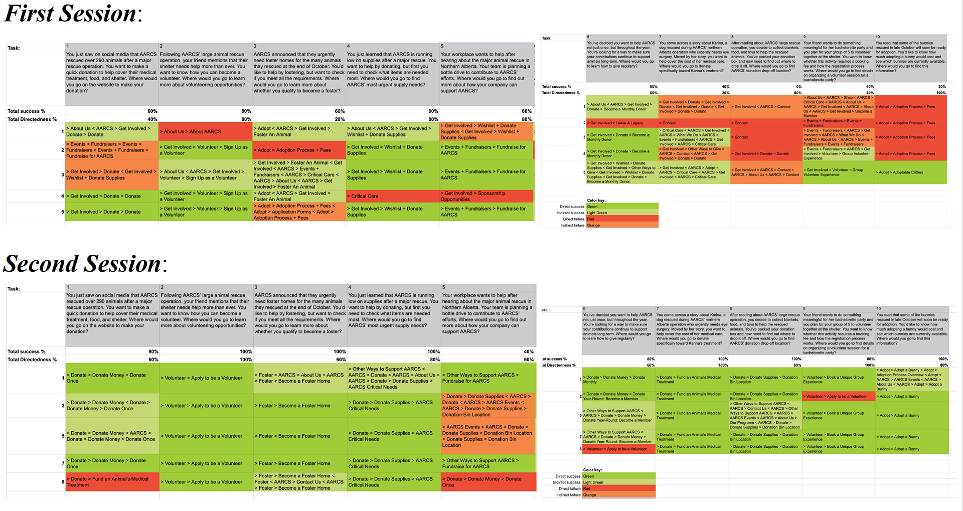
Comparison of user pathways in both tree testing sessions. (Hudon, 2025)
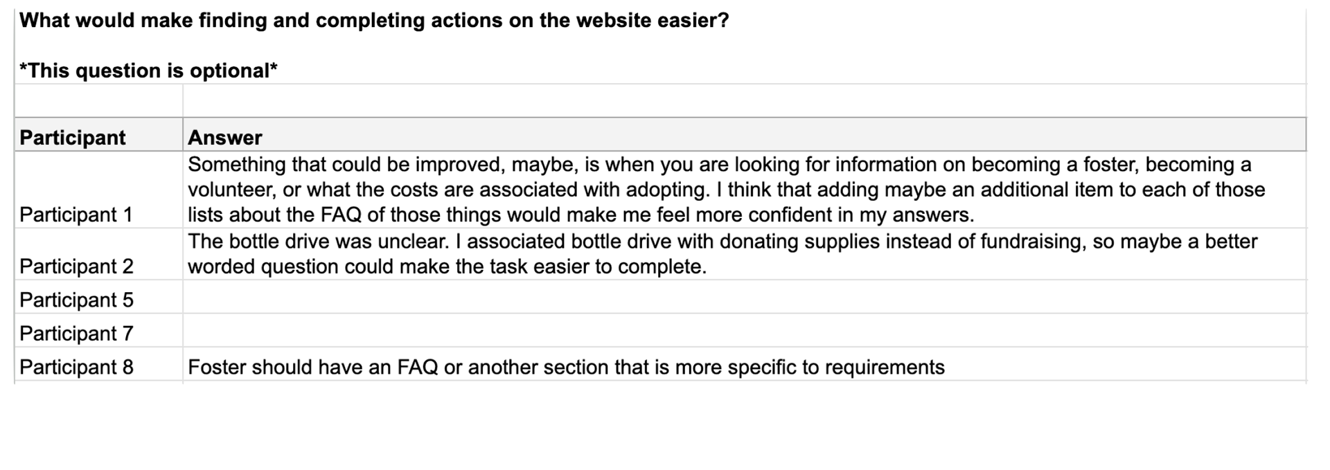
Additional feedback provided by the participants from the second tree test. (Hudon, 2025)
Key Findings
- Participants struggled when navigation required interpretation rather than direct, concrete language.
- Unfamiliar terminology and deeper menu structures resulted in lower success rates and increased hesitation.
- The second tree test demonstrated major improvements in task success, first-click accuracy, and overall directedness.
![Tree Testing 1 [Current AARCS Website] Results](https://cdn.myportfolio.com/37ba0703-e2e7-469c-b8d8-a0dd094102f9/3ecac427-32bb-4400-9f7b-7984d42ef329_rw_1920.png?h=5c13b591fbd992d3e755a3c93ff96dcc)
Tree Testing 1 [Current AARCS Website] Results
![Tree Testing 2 [Improved AARCS Website] Results](https://cdn.myportfolio.com/37ba0703-e2e7-469c-b8d8-a0dd094102f9/95053e15-3314-429c-b547-5824d8debb2d_rw_1920.png?h=60310ee28281ffdca247358b29553db4)
Tree Testing 2 [Improved AARCS Website] Results
The tree testing study revealed that many users struggled to locate important pages related to volunteering, donating, and fostering. Tasks that relied on vague labels or unfamiliar terminology often resulted in confusion and reduced confidence while navigating the site.
AARCS Website Usability Score Improved from 45.5 to 68.5 After Improving Website Structure
Some tasks increased from near 0% success rates to full completion across participants, reinforcing how strongly language and navigation structures influence users’ confidence and willingness to engage. These findings ultimately revealed how even small moments of confusion can discourage people from taking action despite already wanting to help.
Proposed Next Steps
Based on the findings and additional feedback from the second tree testing, I created a revised sitemap that:
- Reorganized content into clearer and more intuitive groups,
- Simplified labels using more direct, action-oriented language, and
- Reduce unnecessary navigation steps throughout the website.
The goal of these revisions was not only to improve usability but also to make supporting AARCS feel more approachable, accessible, and less overwhelming for people navigating the website.